ShopDreamUp AI ArtDreamUp
Deviation Actions


Suggested Deviants


Suggested Collections


You Might Like…


Featured in Groups


Description
Please download for full view!
If anybody would like me to turn my original artworks into prints, please let me know by comment or e-mail (mailshadowfire@gmail.com) and provide the title of the artwork.
Please go to my art site, LightWater [link] to view more art works of mine as well as some downloadable goodies.
I'm not really assuming that people will really use my art, but just in case. (Wink)")
1. You must link back! It would be great if you link back on the page the art is used, but a credit page would do. (Smile)")
2. Do not submit them to any site unless you can personally display a credit link with the art work!
3. You are allowed to make them into graphics (cropping, changing colours, etc) and put them on your site for other people to use as long as you give credit.
4. You are not allowed to use any artworks or goodies for profit!
Basically I just ask for you to give credit if you use them. Don't submit them to sites (especially galleries).... I've seen a lot of nasty forum threads dubbing "Bad fanart" and crap. =_= Don't do that, please.
ANYWAY, here are my comments from 2012!
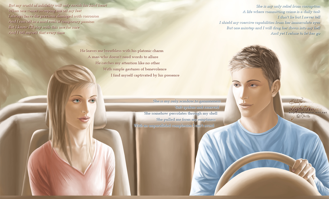
Inspired by the movie Drive.
I had no idea what to expect going into the movie as I basically had no idea what it was about. And I'm glad I didn't because I would've lost the surprise the factor. Damn, that was a good movie. Totally underrated! What really inspired this pic is the Driver. In the first 30 minutes, he really seemed like a kindhearted guy despite that he is a criminal. I just love his quietness and that he responds mostly with a smile. But at the same time I was joking to myself about how his character could totally be one of those pyschopath killers from Criminal Minds.") Funny enough, as the movie progressed, I was really shocked by the kind of things he is capable of and my "joke" wasn't suuuper off. Anyway, I'm ranting, but it really was just the "two sides" to this character that gave me inspiration.
Funny enough, as the movie progressed, I was really shocked by the kind of things he is capable of and my "joke" wasn't suuuper off. Anyway, I'm ranting, but it really was just the "two sides" to this character that gave me inspiration.
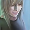
It's been a long time since I drew 2 characters in one piece.. I'm no good at them. This is the first time that I put a lot of text on a CG but I felt that it was necessary in this case. I wanted to portray two people who have met quite recently and are attracted to each other. The text in the middle (female-pink, male-bluelol can I get more stereotypical?) shows their thoughts about the other party and how "perfect" they think they are and this reflects in the image itself. However, on the top corners shows their guilt towards the truth about themselves and this completely contrasts with how the other person perceive them. Each person has such a good impression of the other and they think they know each other but in reality they are completely naive about the other person's past/true nature.
I was super nervous when I was painting the woman's face (I started hers first) because even spending a long time on it, she still looked so ugly. THANKFULLY she turned out alright in the end. I had trouble with the guy too. I was practically done his face but he just looked so damn fugly. His ugliness was just unacceptable so I went back and to fix it, and I am SO glad it actually worked instead of making him look even worse. I tried to paint them as how the other person sees them: for the girl, I tried to make her look as innocent and sweet as possible but she is actually incredibly unfaithful. For the guy, I wanted him to look very kind and non creepy/pervy but he is a criminal that can easily threaten and murder people.
I tried out an "unique" hair style for the girl, having the front pulled back with baby hairs falling down (normally I hate baby hairs) but when I resize the picture the top of her hair looks so.. blotchy and unnatural. Really not pleased by the way the guy's hair turned out too.") Guy's shirt turned out pretty well but the girl's clothing folds are just awkward (especially on the torso area).
Guy's shirt turned out pretty well but the girl's clothing folds are just awkward (especially on the torso area).
Lighting's all over the place, I know. They're supposed to be driving in a car. Apparently it's a convertiblebut now it just looks like a cardboard box. Oh no, they're not wearing seat belts..... I was too lazy to add them.
This was another piece that just went dragging on at the end.. just kept going on & off. I left the text to the very end. Had some ideas brainstormed but I am sooooo bad with words. This is why I am not a writer. I did my best, kay? I didn't plan the placement to look like this but this I think this is the best way it'll fit the image. I planned to make the "impression" text closer to the top and the "truth" text lower and onto the side but that didn't turn out well. Since I want viewers to read the "impression" text first, I realized the best placement for them is to be in the middle. And since the top really are the only place left, I put the "truth" text there.
Character © ShadowFire
Art © ShadowFire
Started - 12/03/20
Finished - 12/04/16
Time - 60 hours
Ref Used - car, car 2, Natlie Portman, Jensen Ackles
If anybody would like me to turn my original artworks into prints, please let me know by comment or e-mail (mailshadowfire@gmail.com) and provide the title of the artwork.
Please go to my art site, LightWater [link] to view more art works of mine as well as some downloadable goodies.
I'm not really assuming that people will really use my art, but just in case.
1. You must link back! It would be great if you link back on the page the art is used, but a credit page would do.
2. Do not submit them to any site unless you can personally display a credit link with the art work!
3. You are allowed to make them into graphics (cropping, changing colours, etc) and put them on your site for other people to use as long as you give credit.
4. You are not allowed to use any artworks or goodies for profit!
Basically I just ask for you to give credit if you use them. Don't submit them to sites (especially galleries).... I've seen a lot of nasty forum threads dubbing "Bad fanart" and crap. =_= Don't do that, please.
ANYWAY, here are my comments from 2012!
Inspired by the movie Drive.
I had no idea what to expect going into the movie as I basically had no idea what it was about. And I'm glad I didn't because I would've lost the surprise the factor. Damn, that was a good movie. Totally underrated! What really inspired this pic is the Driver. In the first 30 minutes, he really seemed like a kindhearted guy despite that he is a criminal. I just love his quietness and that he responds mostly with a smile. But at the same time I was joking to myself about how his character could totally be one of those pyschopath killers from Criminal Minds.
It's been a long time since I drew 2 characters in one piece.. I'm no good at them. This is the first time that I put a lot of text on a CG but I felt that it was necessary in this case. I wanted to portray two people who have met quite recently and are attracted to each other. The text in the middle (female-pink, male-blue
I was super nervous when I was painting the woman's face (I started hers first) because even spending a long time on it, she still looked so ugly. THANKFULLY she turned out alright in the end. I had trouble with the guy too. I was practically done his face but he just looked so damn fugly. His ugliness was just unacceptable so I went back and to fix it, and I am SO glad it actually worked instead of making him look even worse. I tried to paint them as how the other person sees them: for the girl, I tried to make her look as innocent and sweet as possible but she is actually incredibly unfaithful. For the guy, I wanted him to look very kind and non creepy/pervy but he is a criminal that can easily threaten and murder people.
I tried out an "unique" hair style for the girl, having the front pulled back with baby hairs falling down (normally I hate baby hairs) but when I resize the picture the top of her hair looks so.. blotchy and unnatural. Really not pleased by the way the guy's hair turned out too.
Lighting's all over the place, I know. They're supposed to be driving in a car. Apparently it's a convertible
This was another piece that just went dragging on at the end.. just kept going on & off. I left the text to the very end. Had some ideas brainstormed but I am sooooo bad with words. This is why I am not a writer. I did my best, kay? I didn't plan the placement to look like this but this I think this is the best way it'll fit the image. I planned to make the "impression" text closer to the top and the "truth" text lower and onto the side but that didn't turn out well. Since I want viewers to read the "impression" text first, I realized the best placement for them is to be in the middle. And since the top really are the only place left, I put the "truth" text there.
Character © ShadowFire
Art © ShadowFire
Started - 12/03/20
Finished - 12/04/16
Time - 60 hours
Ref Used - car, car 2, Natlie Portman, Jensen Ackles
Image size
1400x846px 637.01 KB
Comments0
Join the community to add your comment. Already a deviant? Log In